

PLOIL BOESCH GROTESK
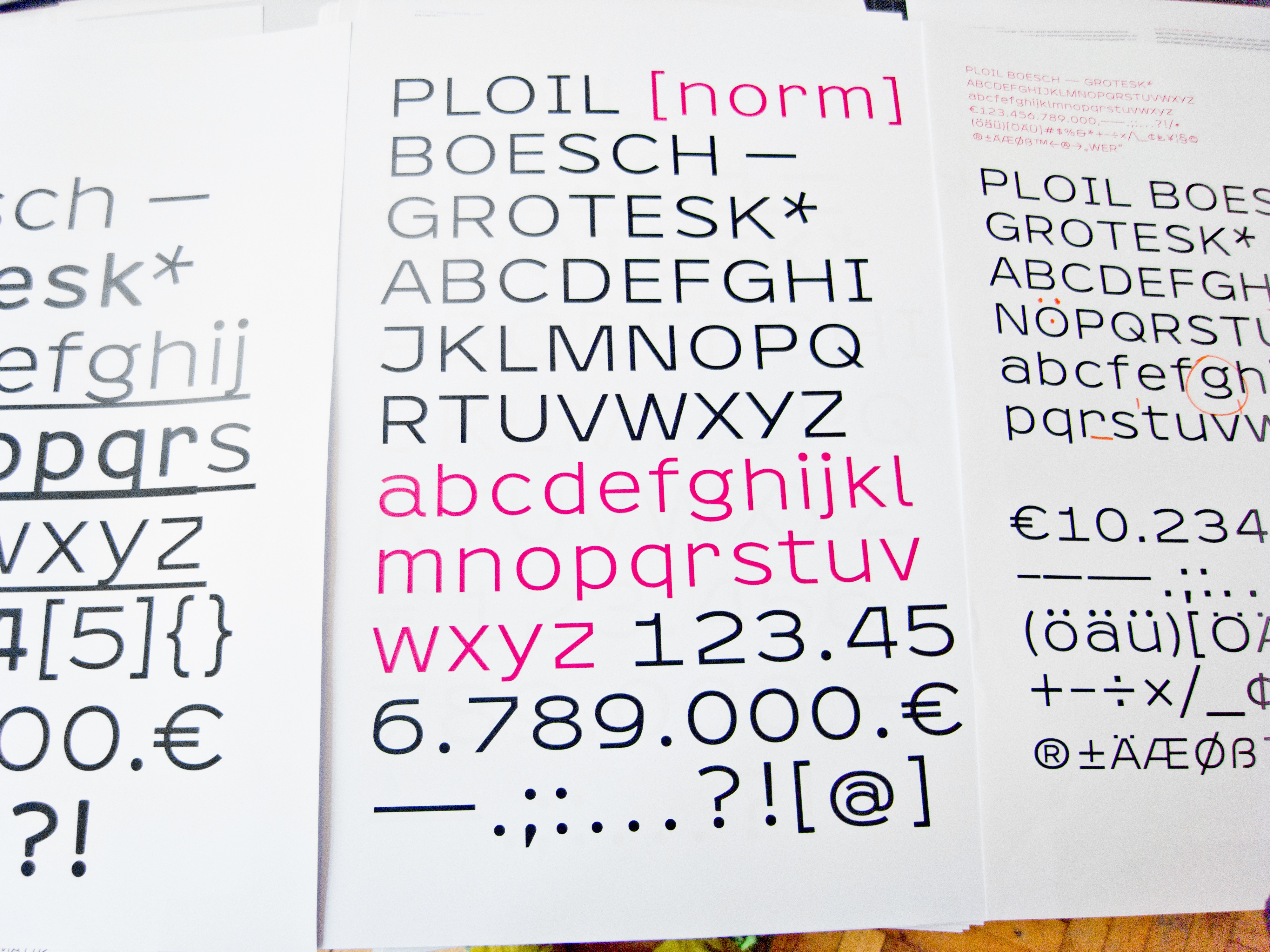
When preparing the relaunch of our Corporate Identity the first objective of the designers was to create typography for logos and headlines. The result of a development process of many months was an excellent individual and exclusive font type for universal use.
The single typographic character, the “Glyphe”, is the smalles entity of expression in a language. This makes it the very basis for our work as lawyers: an individual and exclusive font is thus a subtle symbol for our aim to provide solutions that are custom tailored for our clients needs.
Developed and designed by Fidel Peugeot, an international renowned typography designer the font is somehow a mirror for one of the leading motives of our work: focus on the essentials.
Our entire corporate identity and this website — all exclusively in PLOIL BOESCH GROTESK are based on that principle.
Fidel Peugeot comments on the new font:
PLOIL BOESCH GROTESK is a font without serifs (Sans Serif) Linear-Antiqua. The font family includes 4 styles: Regular, Italique, Bold and Bold Italique. The font has a wide approach and the small letters are quite dominant in relation to the capitals.
The label “Grotesk” is common in professional circles and used as a synonym for “Sans Serif”. It refers to the fact that the first sans serif fonts were originally considered a “grotesque” but nevertheless appealing aberration from established principles, as the lack of serifs contradicted all reading habits at the time. Grotesk-fonts are regularly based on more or less simple glyphs which are good to depict on computer monitors and have therefor developed to be standard fonts in text processing systems.